/ Case Study · Event Branding
Pharmaconex.
Branding an industry. Designing the meeting point of pharmaceutical manufacturing in the region.
/ The Brief
A specialized industry deserves a specialized brand.
Pharmaconex is the regional exhibition and conference for the pharmaceutical manufacturing industry — the place where suppliers, manufacturers, regulators and decision-makers meet, source and shape what gets made next.
The category had no shortage of generic trade-show aesthetics — blue gradients, anonymous capsules, recycled symbolism. We were asked to build something else: an identity confident enough to host a specialized industry and flexible enough to live across an entire event ecosystem.
/ The Identity
Built from the industry, not on top of it.
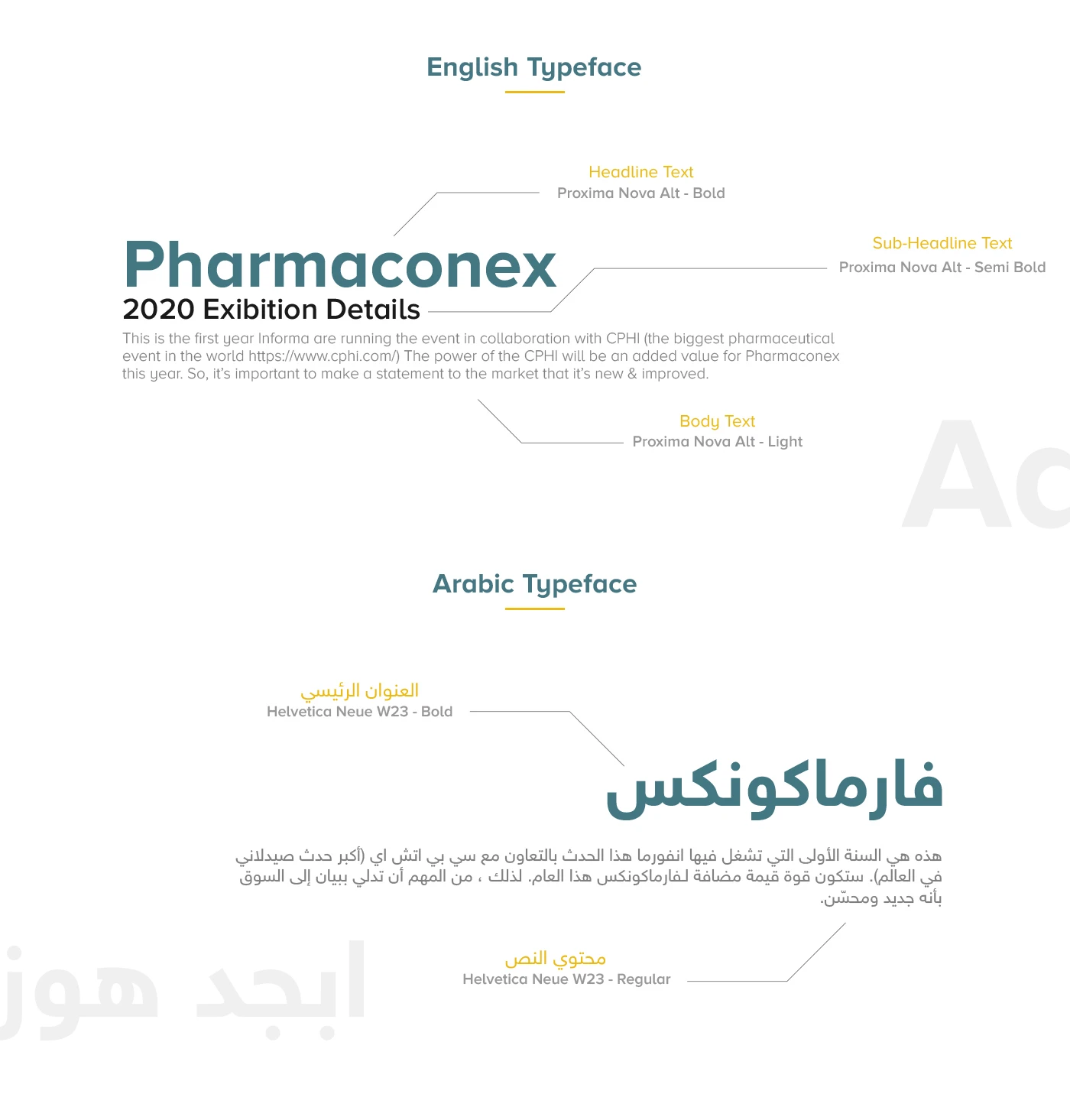
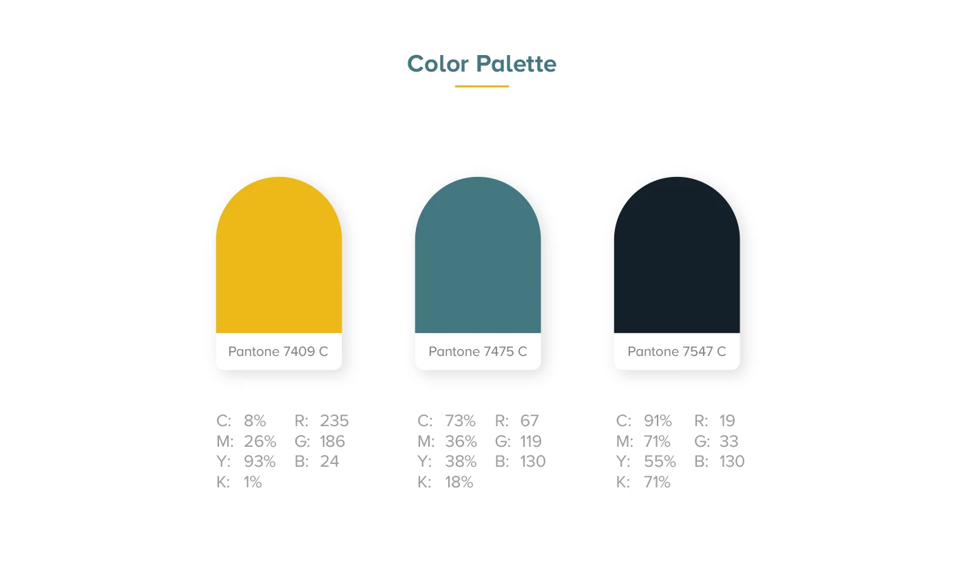
The wordmark is engineered, not decorated. Precise geometry, measured proportions, a single distinguishing accent — a mark that belongs in a manufacturing context, not a marketing one.
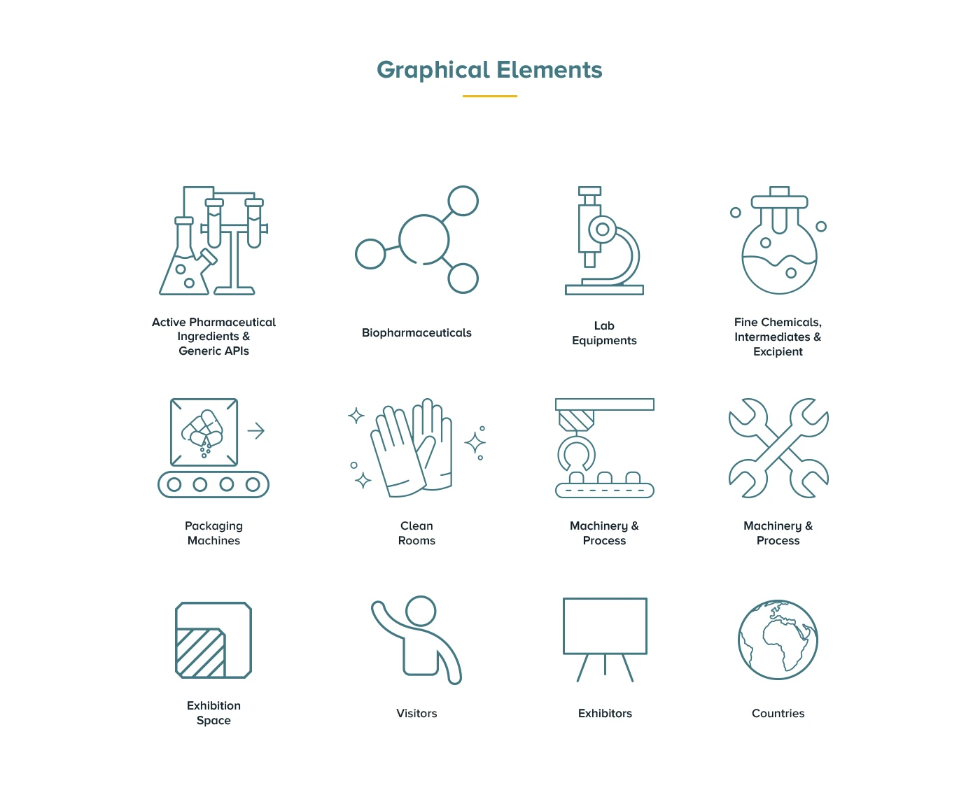
The accent doubles as a system: a connecting node that threads through key visuals, applications and signage — signalling the role of the event as the meeting point of the industry.
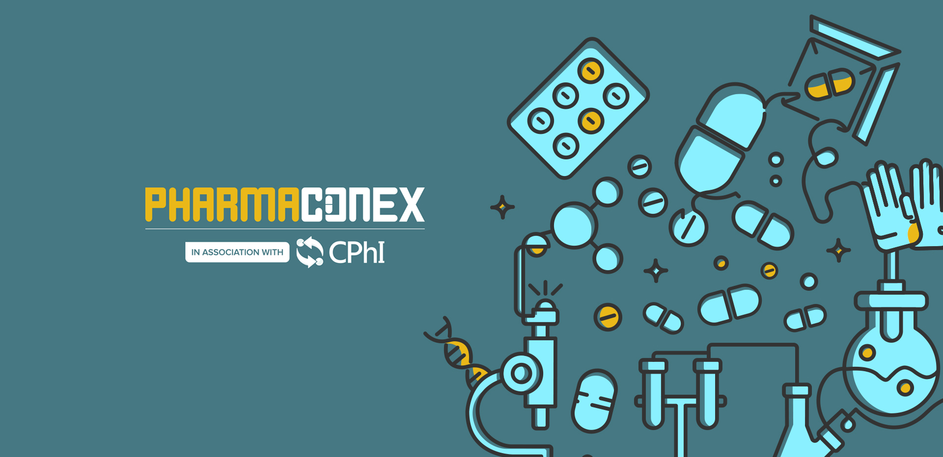
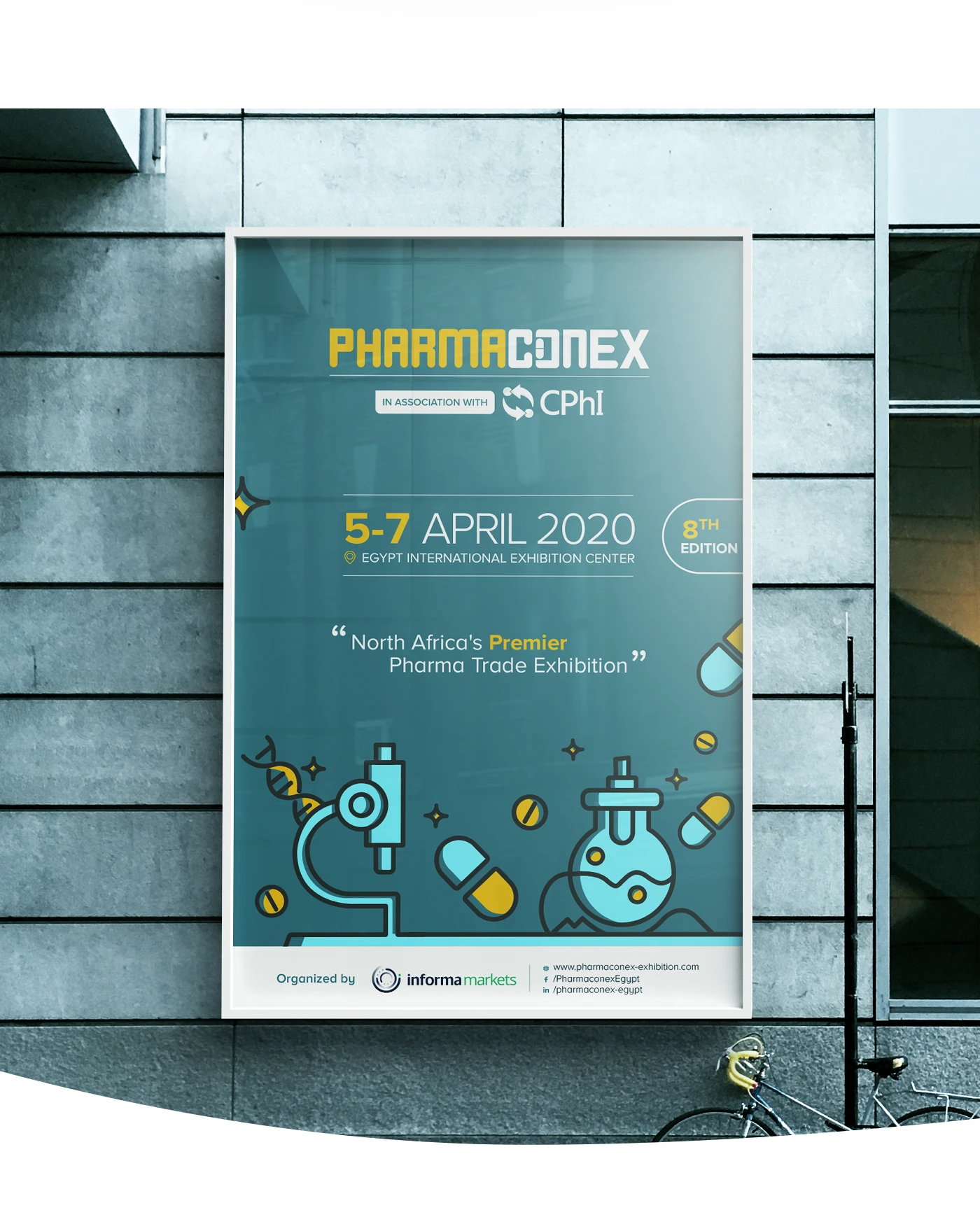
/ Key Visual
A visual language built to travel.
The campaign visual translates the brand mark into a system of overlapping forms — precise, modular and unmistakably industrial. It reads at exhibition scale, on a phone, on a delegate badge, and across every printed surface in between.
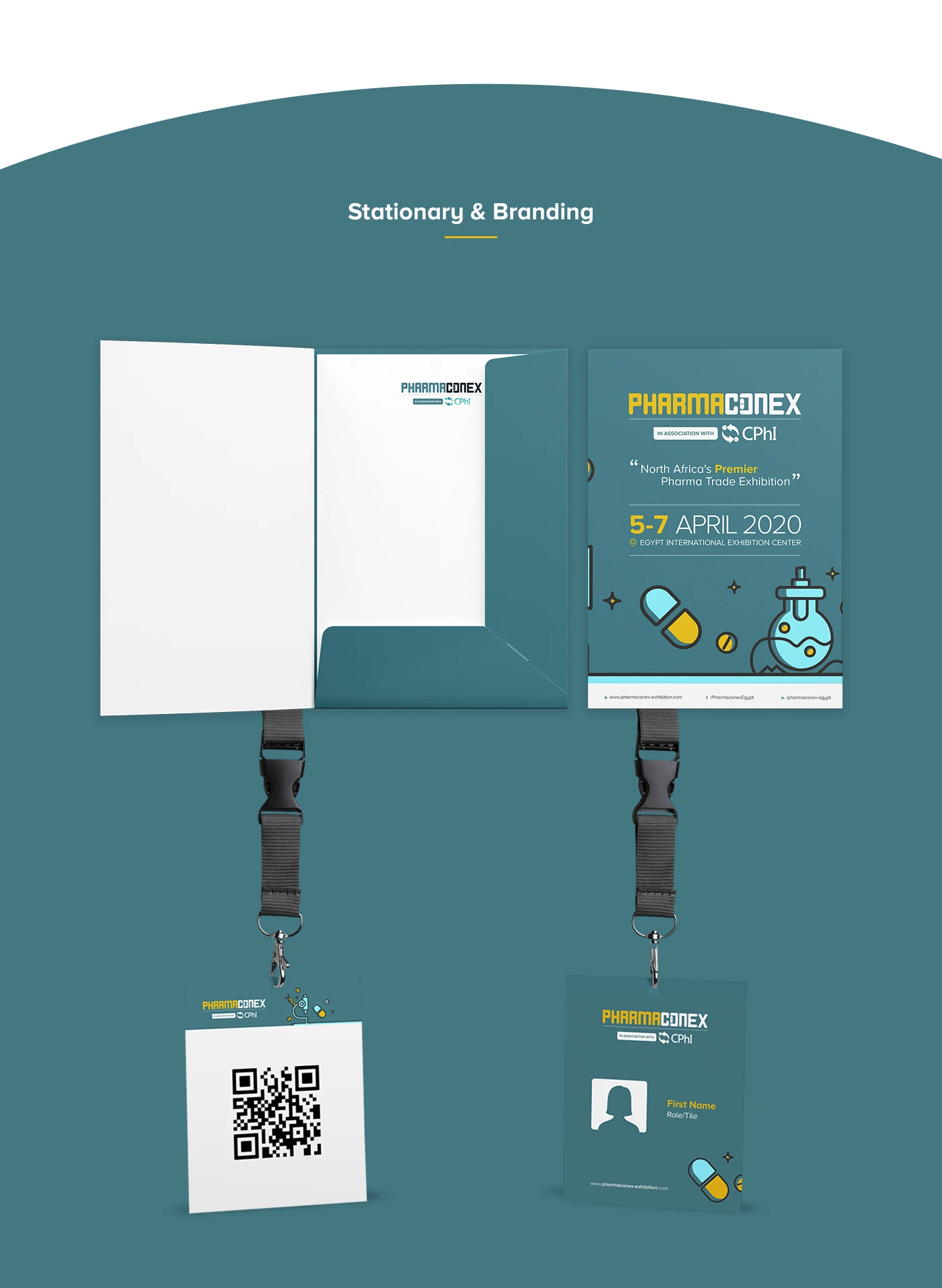
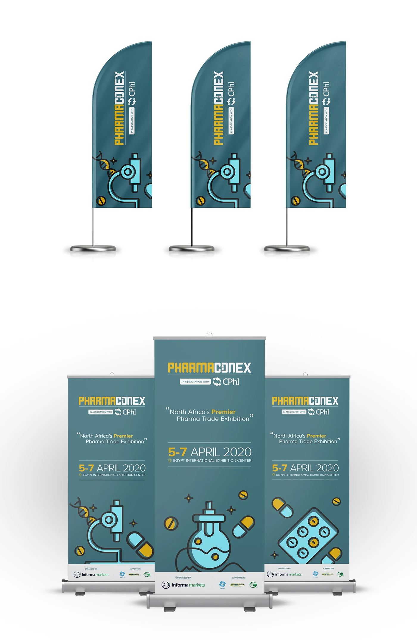
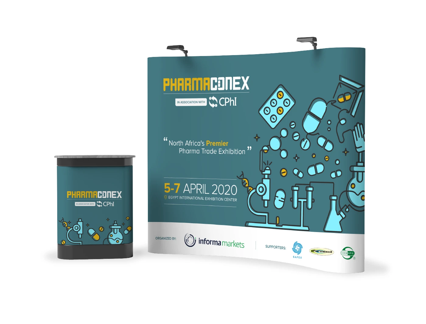
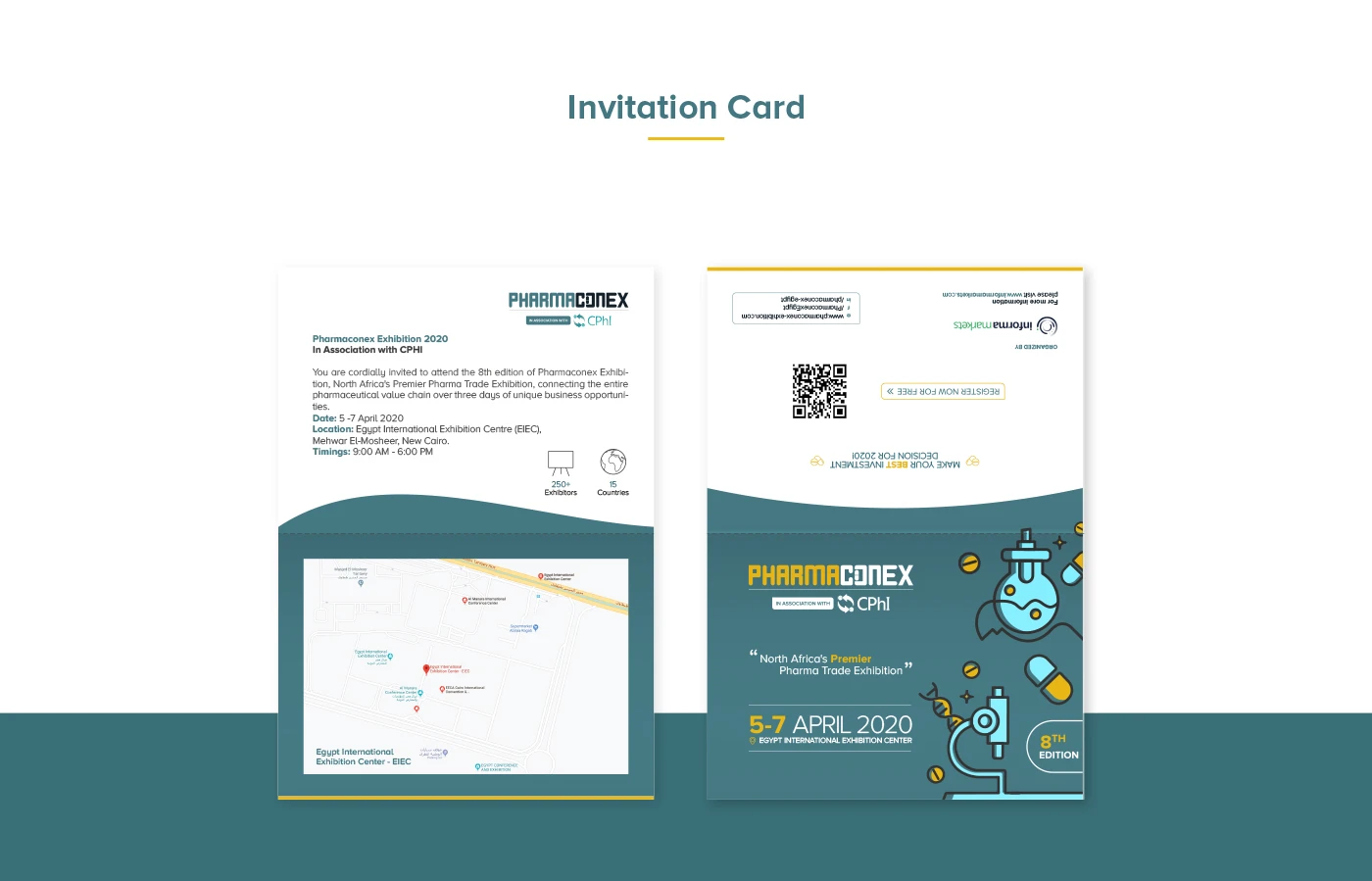
/ Event System
One identity, an entire event.
Wayfinding, lanyards, badges, programs, stage backdrops, delegate kits, banners, social cards — every touchpoint designed inside a single system so the event felt curated, not assembled.
Each piece carries the same engineered logic: a fixed grid, a controlled accent, and typography that doesn't compete with the content sitting inside it.
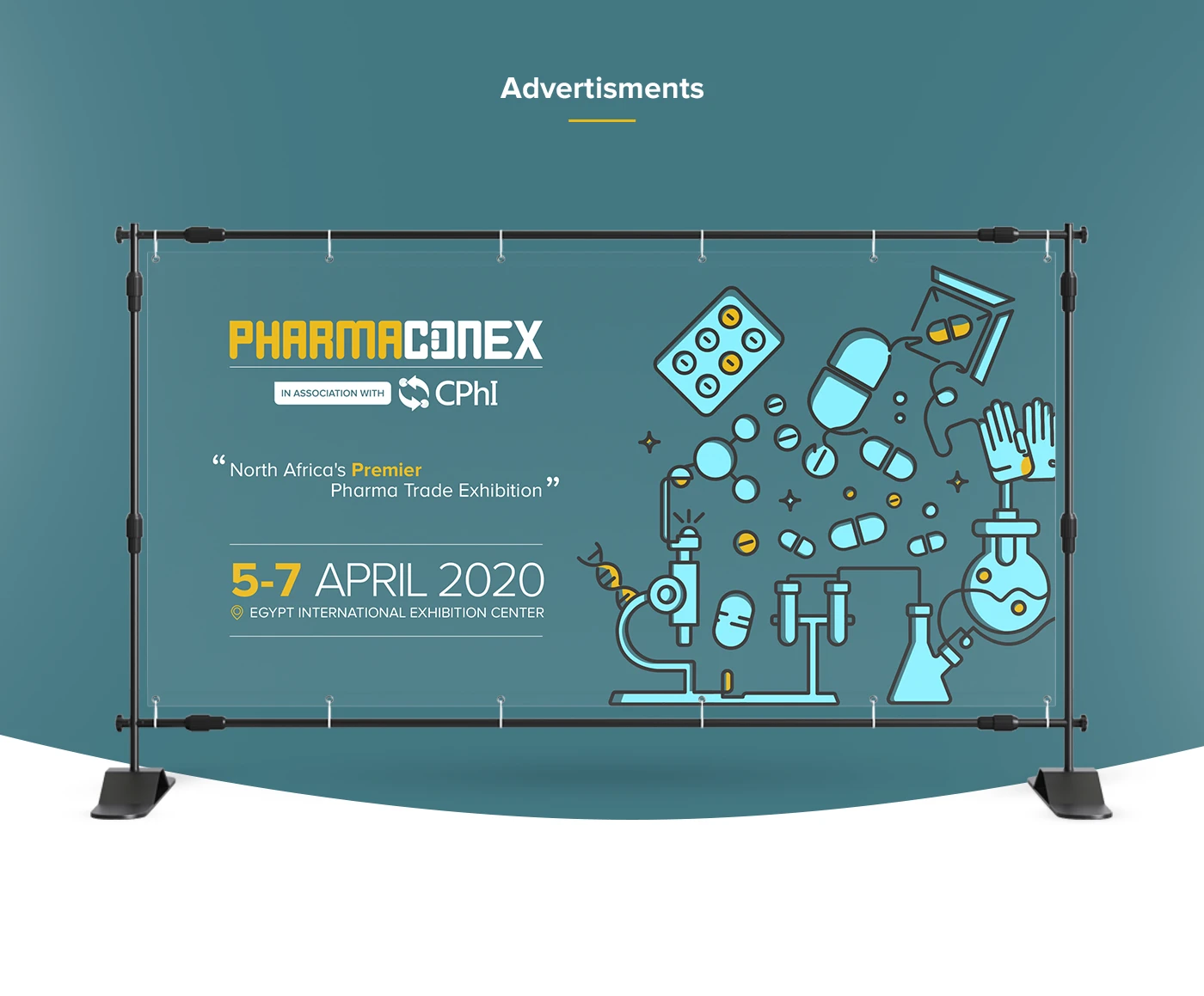
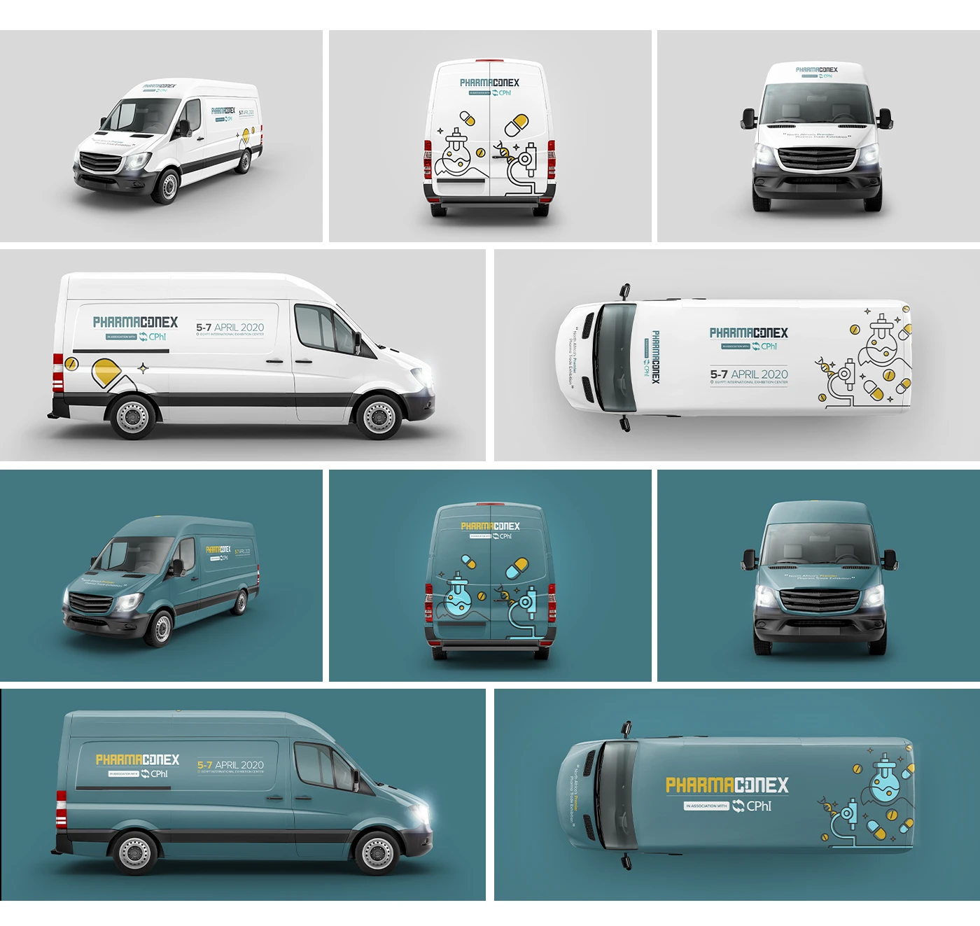
/ Onsite
Designed to be experienced, not just seen.
The identity expands across hall entrances, exhibitor signage and large-format environmental graphics — turning the venue itself into a continuation of the brand.
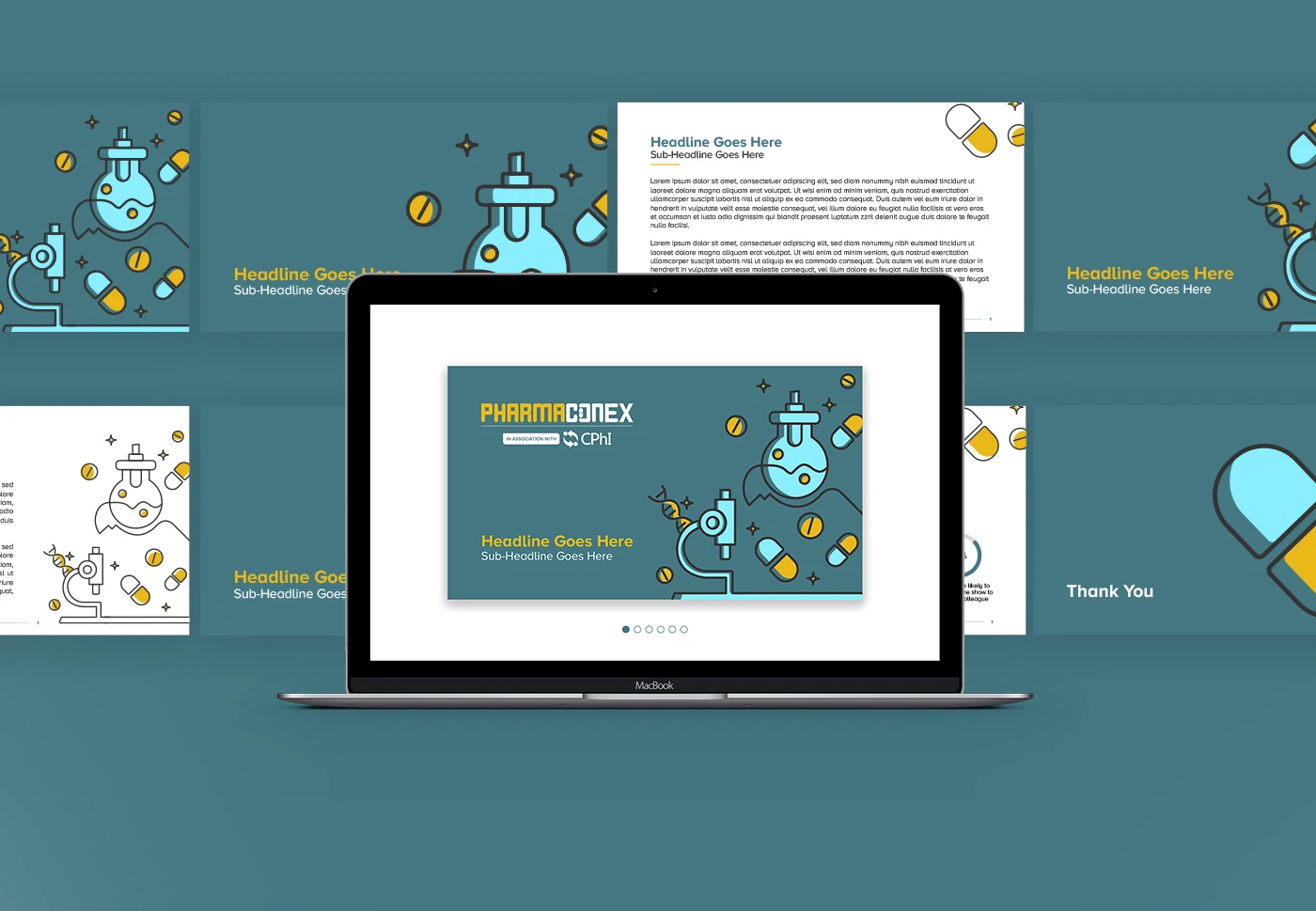
/ Digital & Social
A brand that scrolls as confidently as it stands.
A modular social system carried the campaign across the pre-event, live and post-event phases — keeping the visual logic intact whether the post was an exhibitor highlight, a conference session, or a delegate testimonial.

/ The Result
An event that finally looks like the industry it represents.
Pharmaconex now reads the way the industry behind it operates — precise, engineered, intentional. The brand holds together across formats, scales and stakeholders, giving the event a recognizable presence year on year.
A specialized brand for a specialized industry.