- client :
Mobile Plus
- SERVICES:
Branding & Positioning
Who Are They?
Mobile Plus is a private corporation established late 2010 in Egypt, which is the largest market in the MENA region. They started by trading mobile phones and has now become an Authorized Reseller for Apple, Hisense & IKU Products.
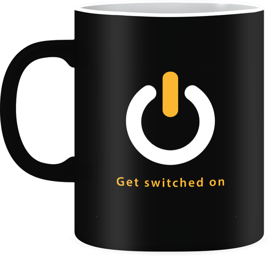
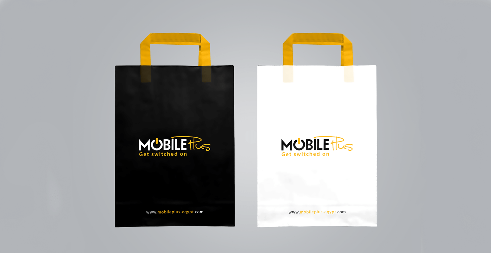
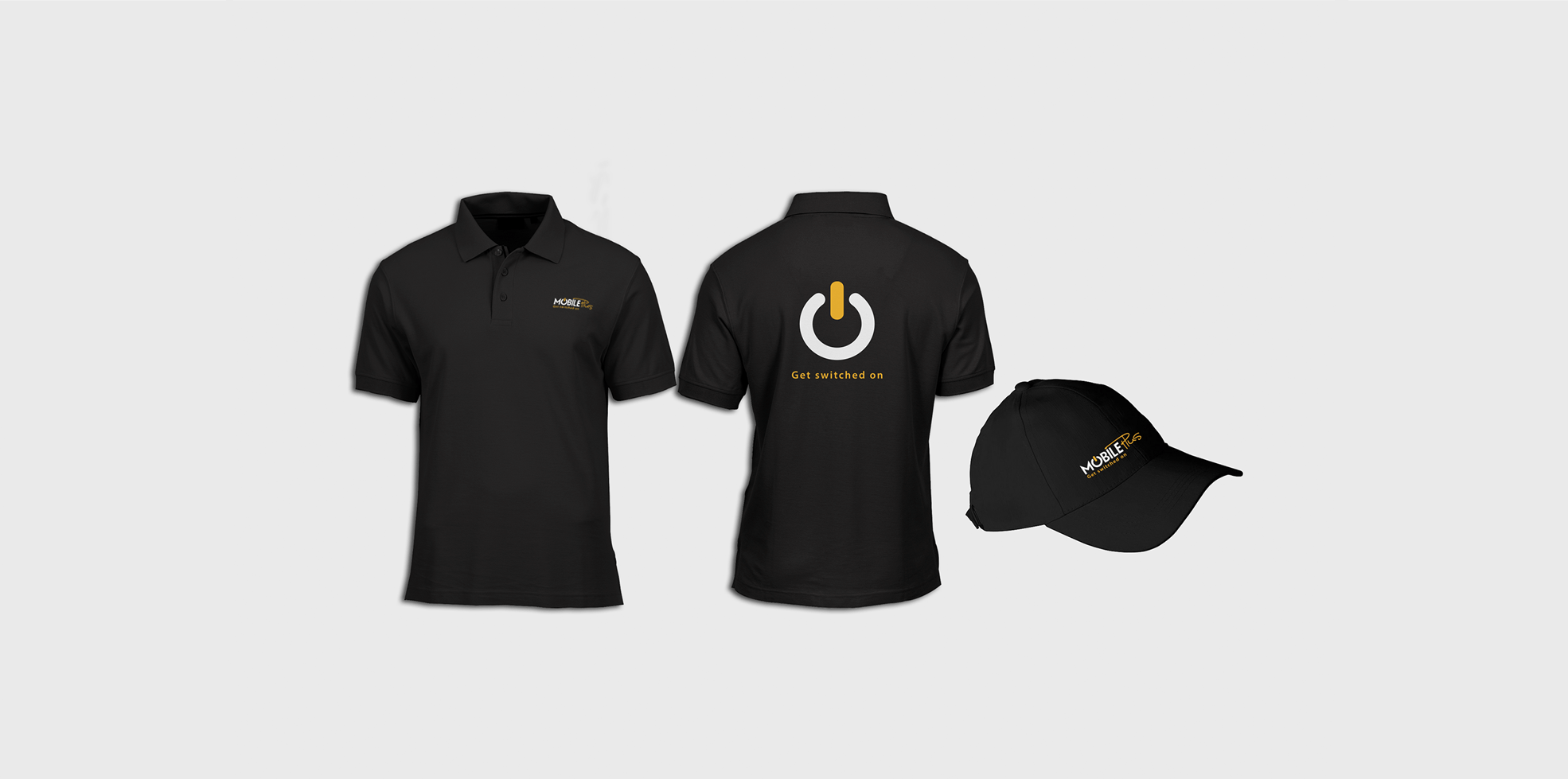
“GET SWITCHED ON” -MobilePlus
The Challenge
Even if you wanted to ignore all of the technical breakthroughs, you couldn't.
So how can we adapt a brand's image to the quick-paced environment while yet making it appealing to the average user? Let's face it, because overcomplicating things may quickly lead to pretentiousness. Fortunately, Mobile Plus discovered us after realizing that a line that thin needed a Fisheye lens.
Brand Attributes
Technology

Network

Worldwide

Fast

Variety

Cooperation

The Solution
After much work done by our research team, we instantly realized that a radical change was needed, while of course keeping original identity preserved. Therefore, the logo was reborn by gathering the brand attributes into a single concept.
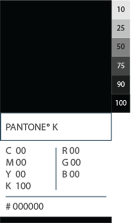
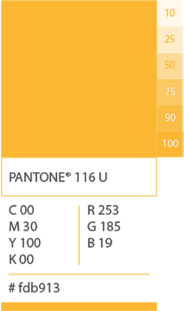
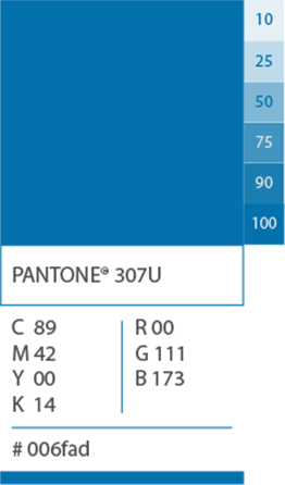
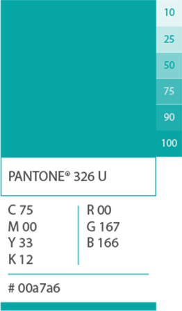
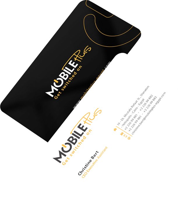
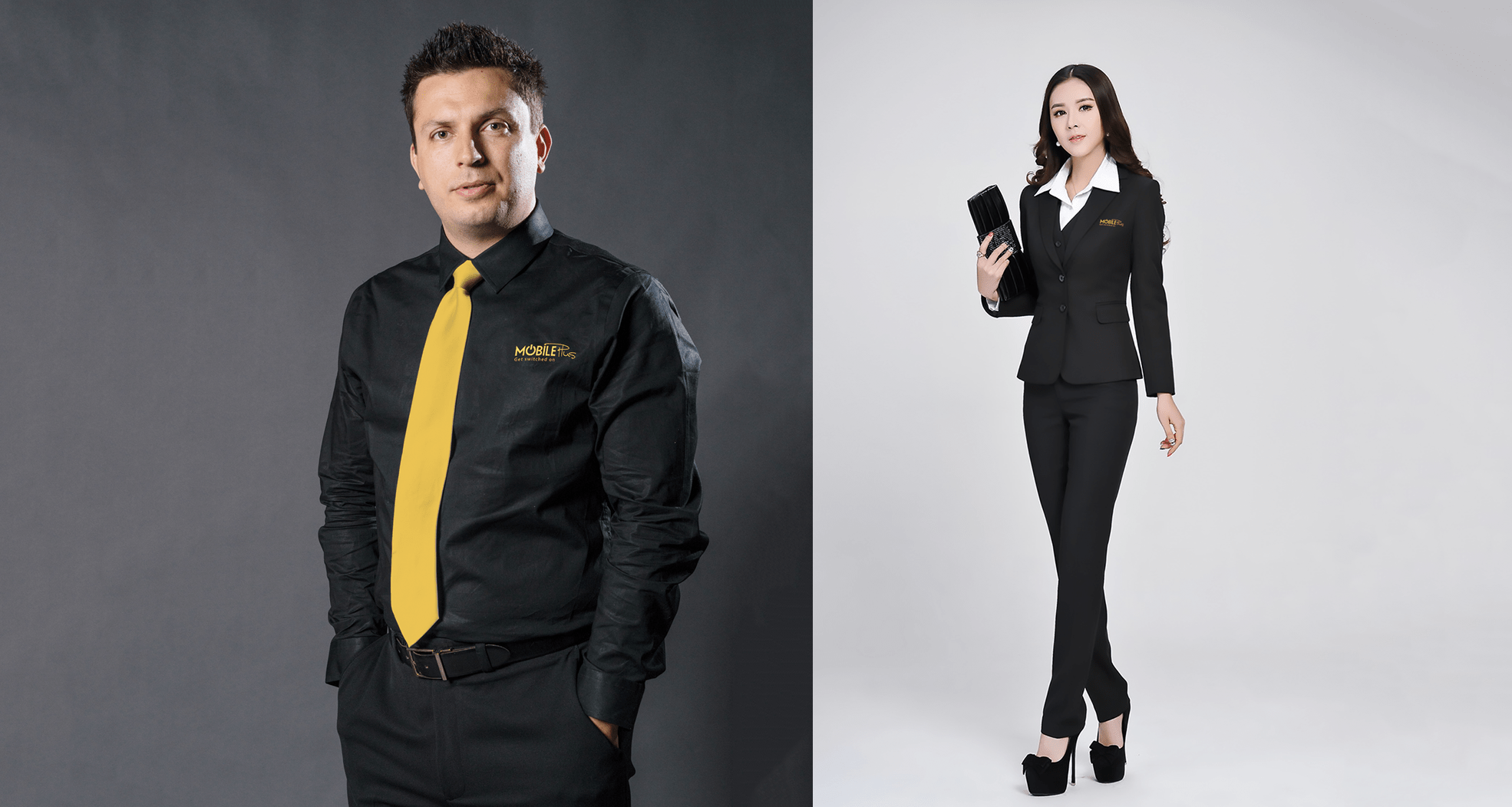
Since the company desired to leave its mark in the MENA region, we chose black and yellow for the colour palette to symbolize energy and at the same time to alert the competitors in the industry.
The message was that Mobile Plus is coming bigger and stronger than ever, and we can proudly say that the message was delivered successfully.
Exploring Directions
We quickly found a few promising directions. Next, we spent time exploring a few selected directions, testing them to make sure our final decision was justified.
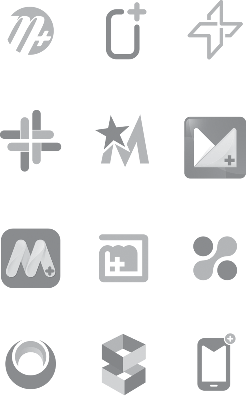
The chosen logo
Color palette


Typography
Latin typeface
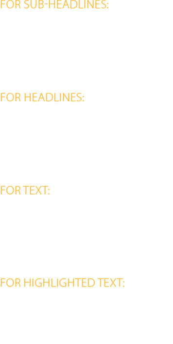

Arabic typeface

Stationary & Advertisement

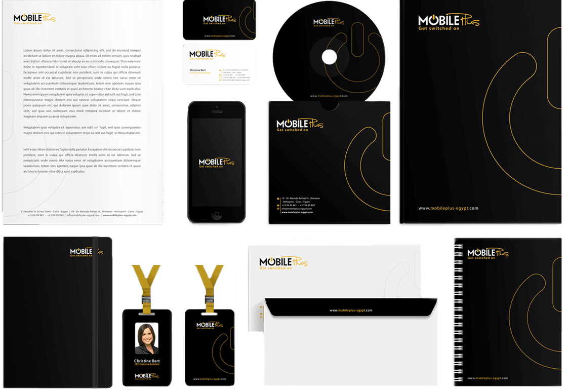


The Result