- client :
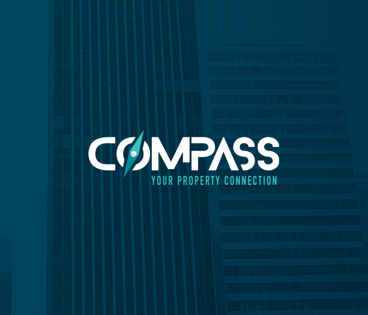
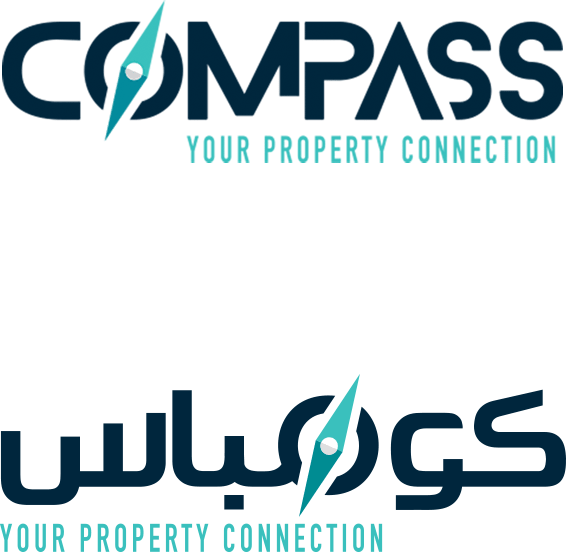
Compass
- SERVICES:
Branding, Positioning & Social Media
Who Are They?
Established in 2015, Compass is a real estate investment and brokerage firm that works in the MENA Region, GCC, and other worldwide markets. They offer consulting in residential, commercial, and real estate investing sectors, amongst other things. Their services depend mainly on direct interactions in whichsmart analysis tools are used according to a strategic vision.
“YOUR PROPERTY CONNECTION”.
The Challenge
The real estate industry is becoming more and more competitive everyday. For Compass to stand-out in such a saturated market, we needed to create a distinctive personality, but not at the cost of the subtlety and elegance you’d expect from a reputable brand in the real estate market.
The Solution
Logo Options:
We also came up with few promising directions for the logo and testing each one to make sure our final decision was justified.
Chosen Option
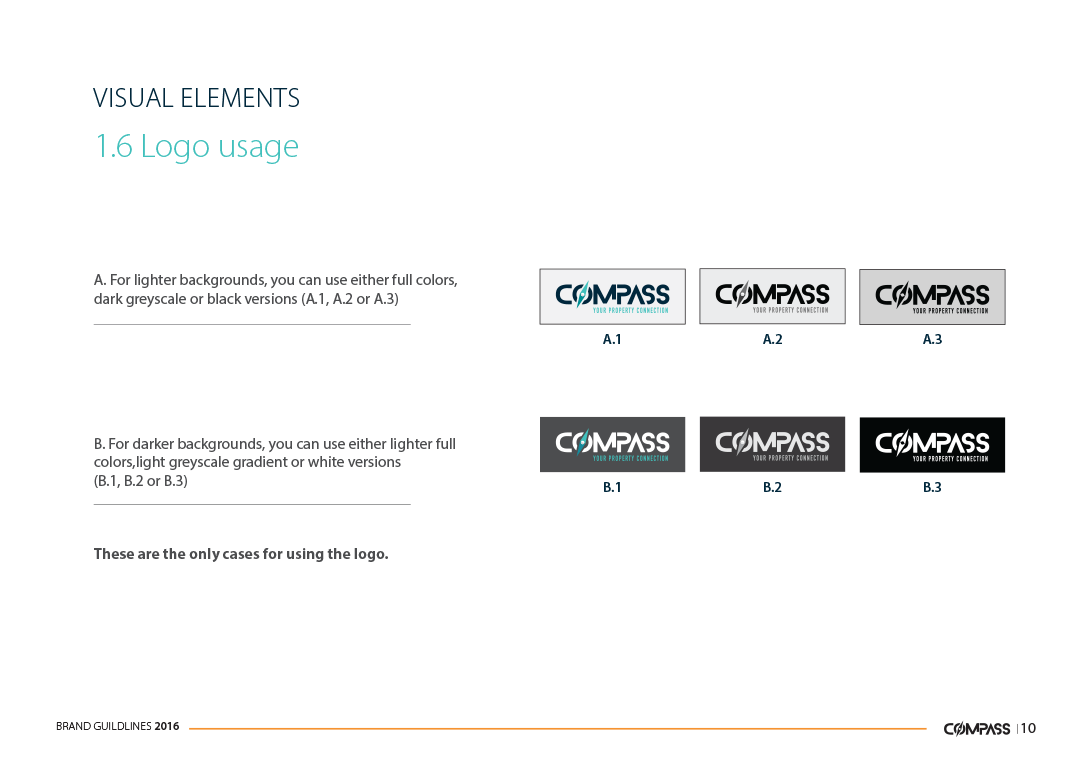
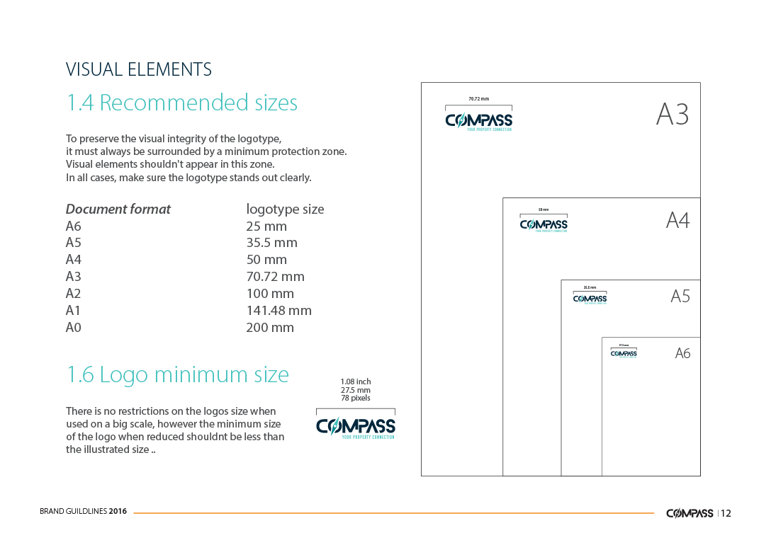
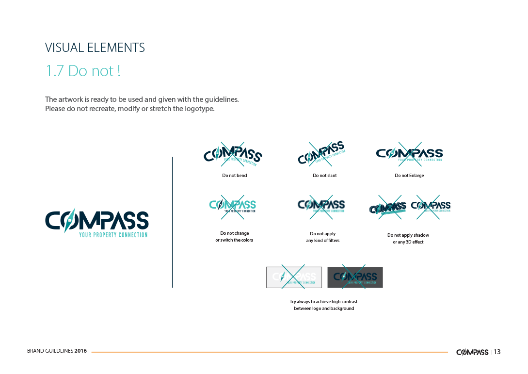
Logo Construction


Protection Zone
Color Palette
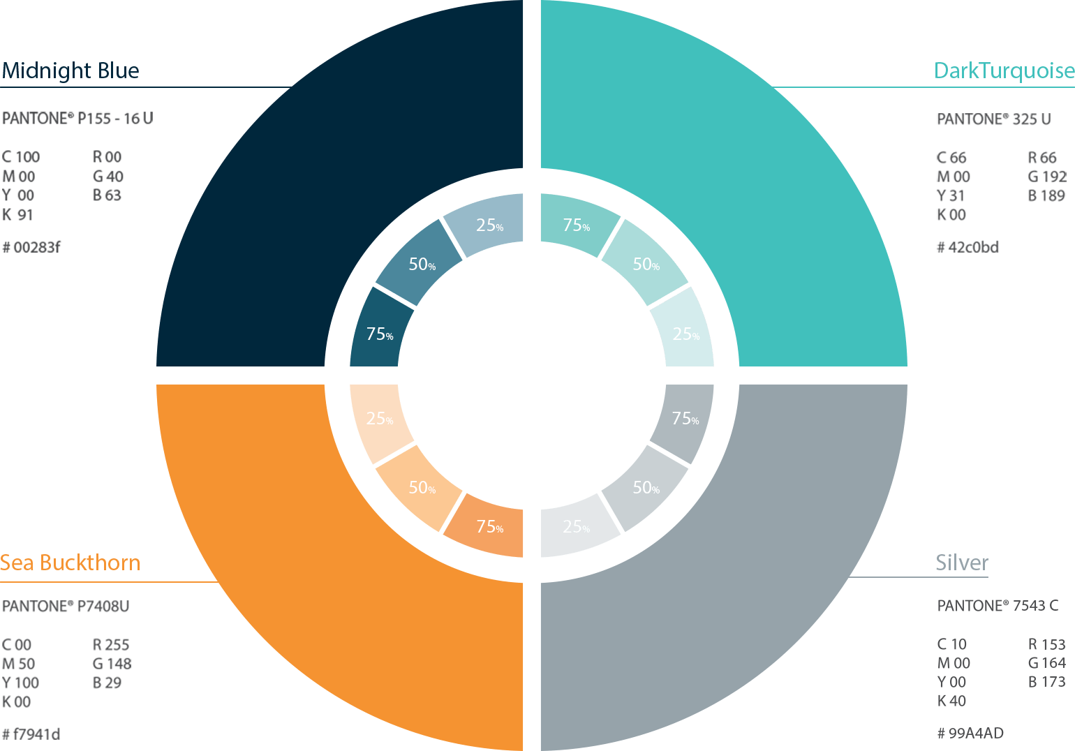
there are 2 cases in which we can use the orange color.
1-You can use it in the footer line in presentations
2-Also you can use it to highlight any text or information to give importance to it.
Typography
Latin typeface

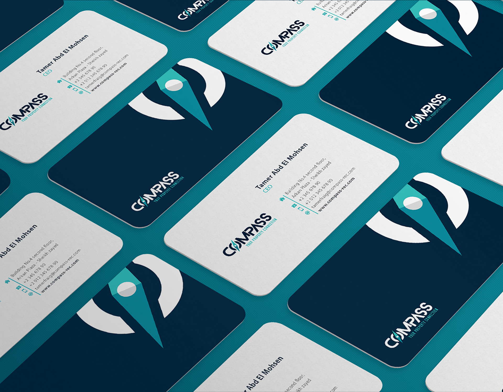
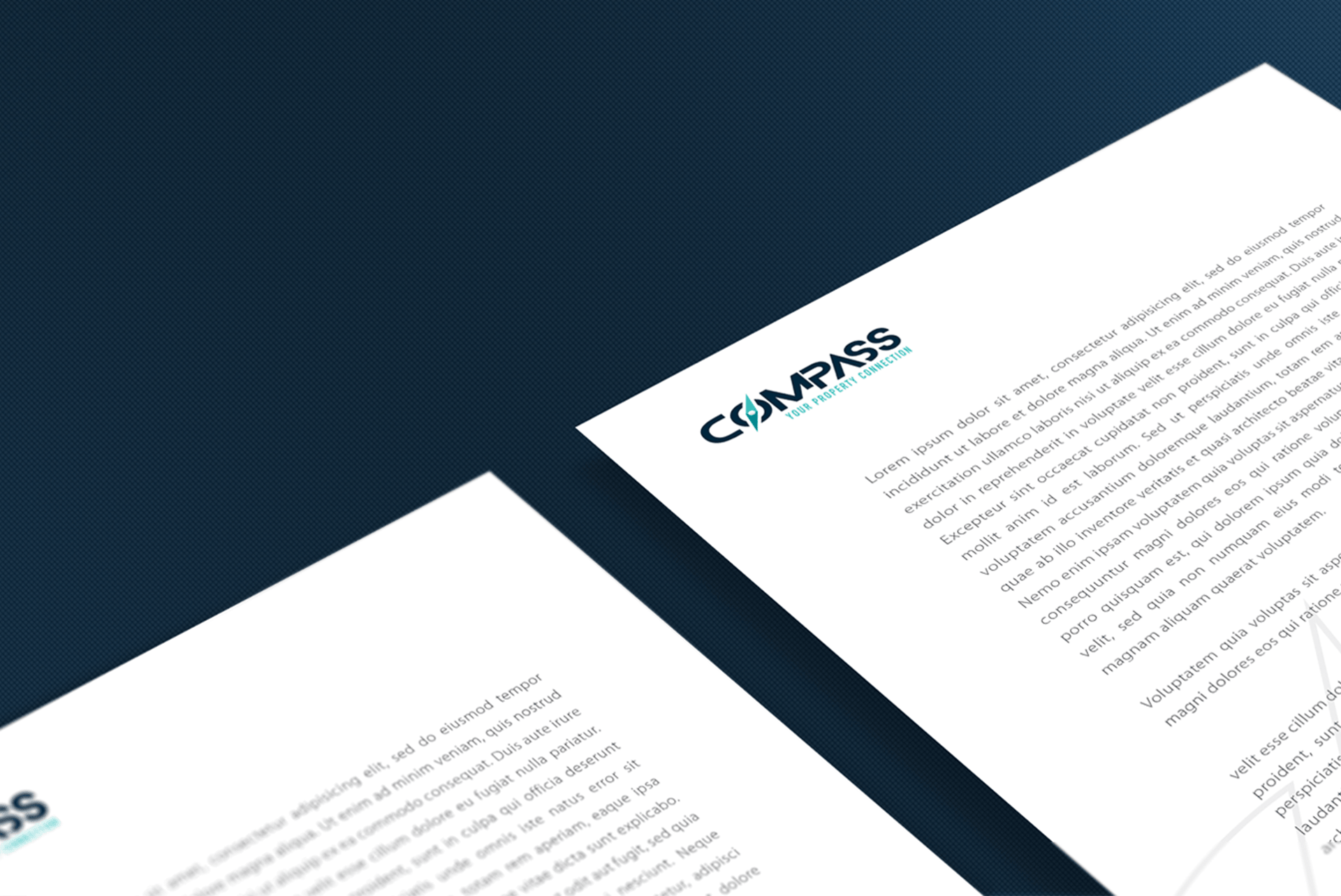
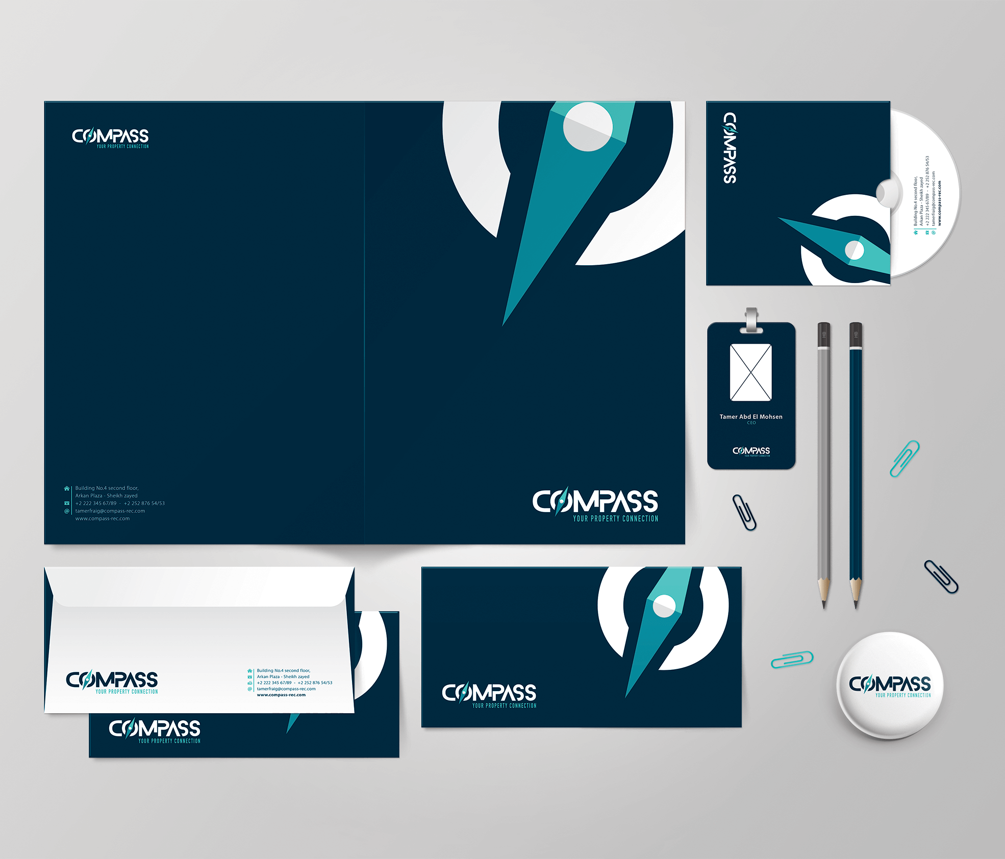
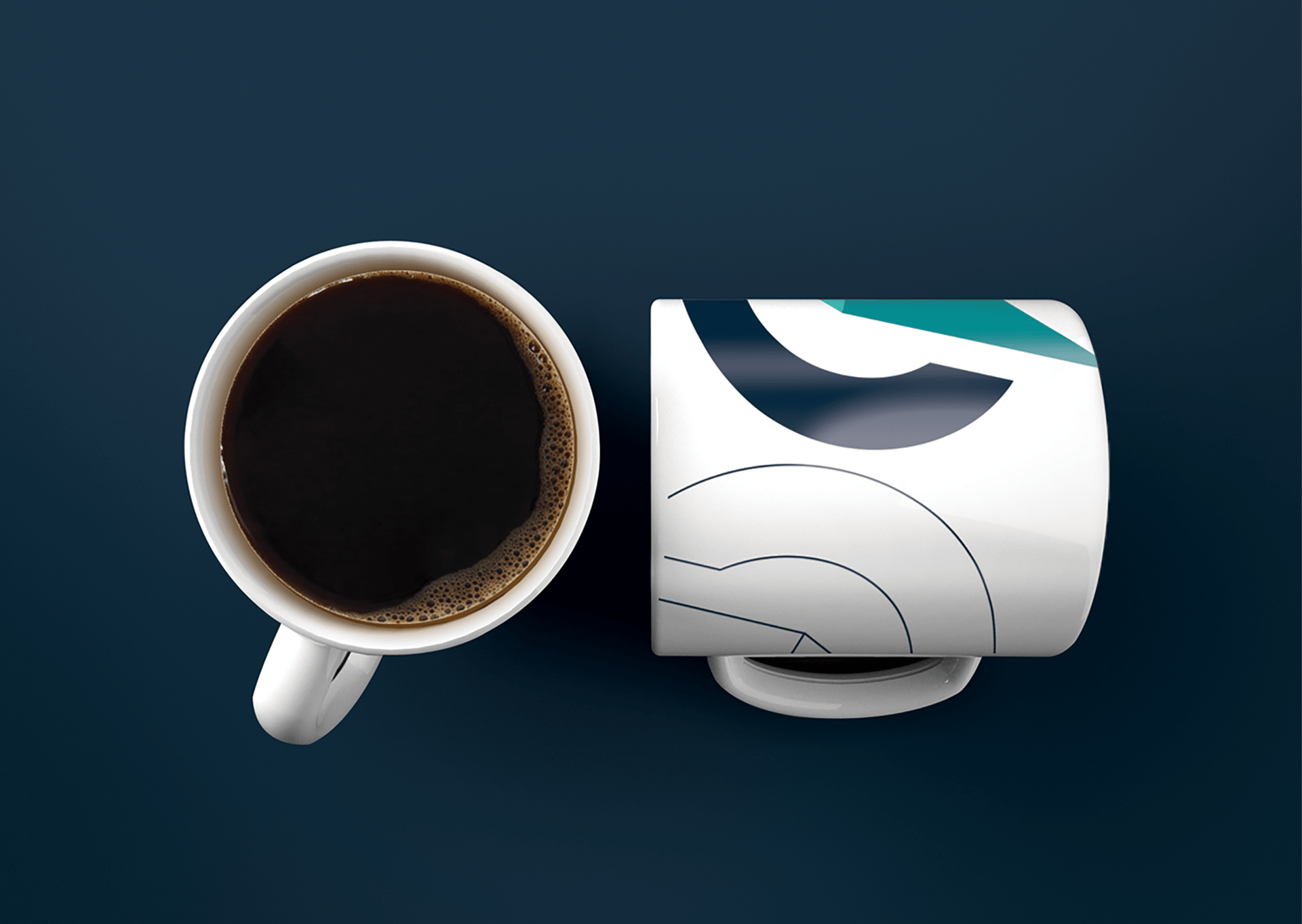
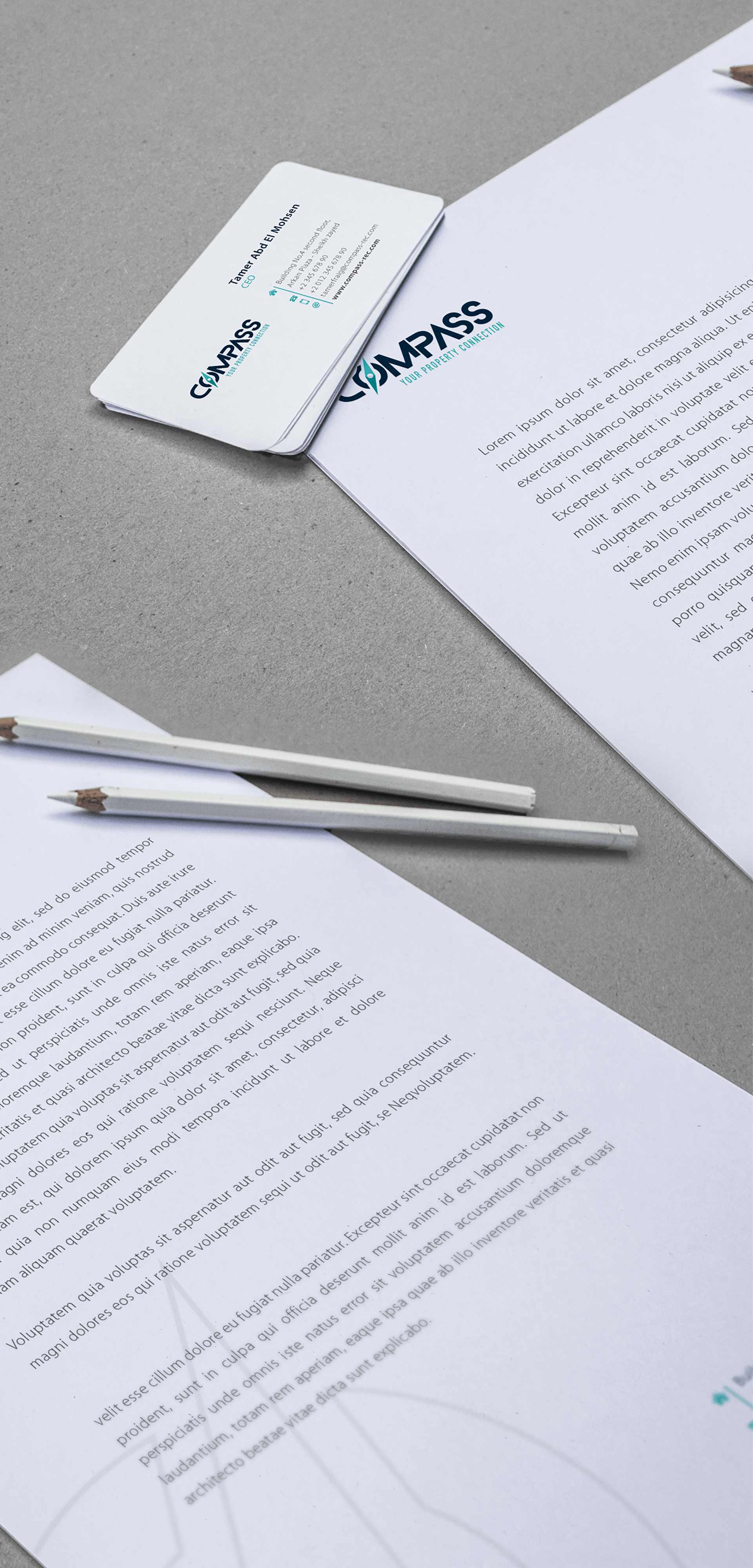
Shots from the guidelines’ brandbook
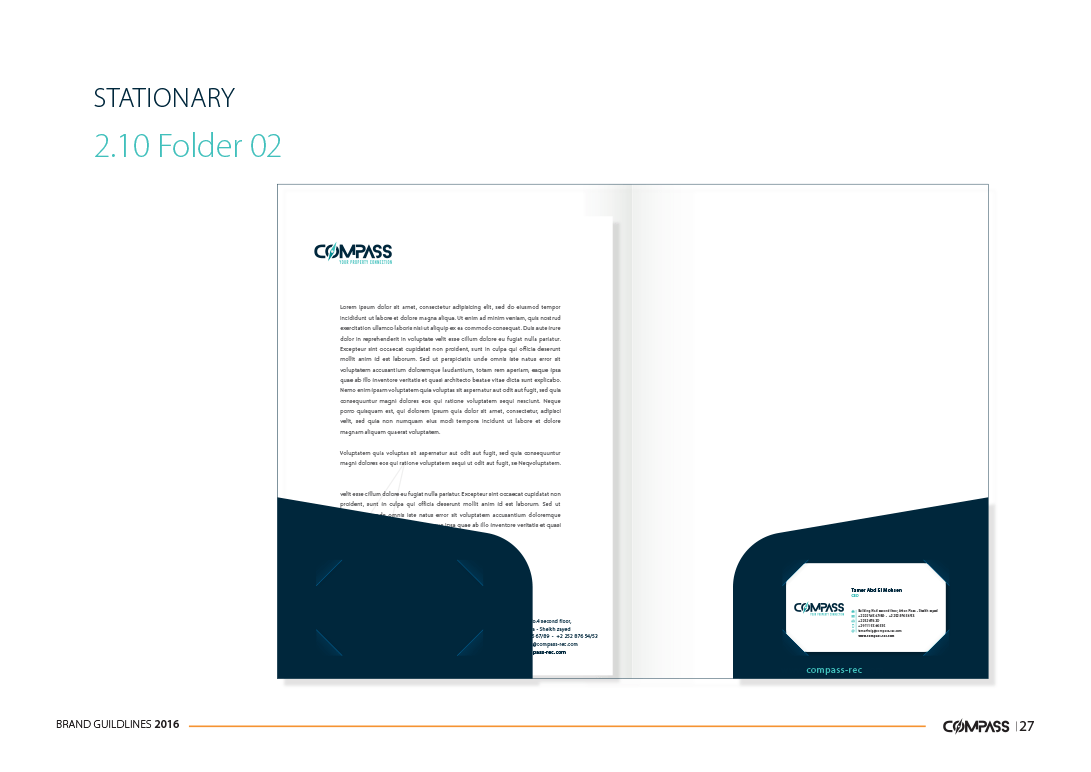
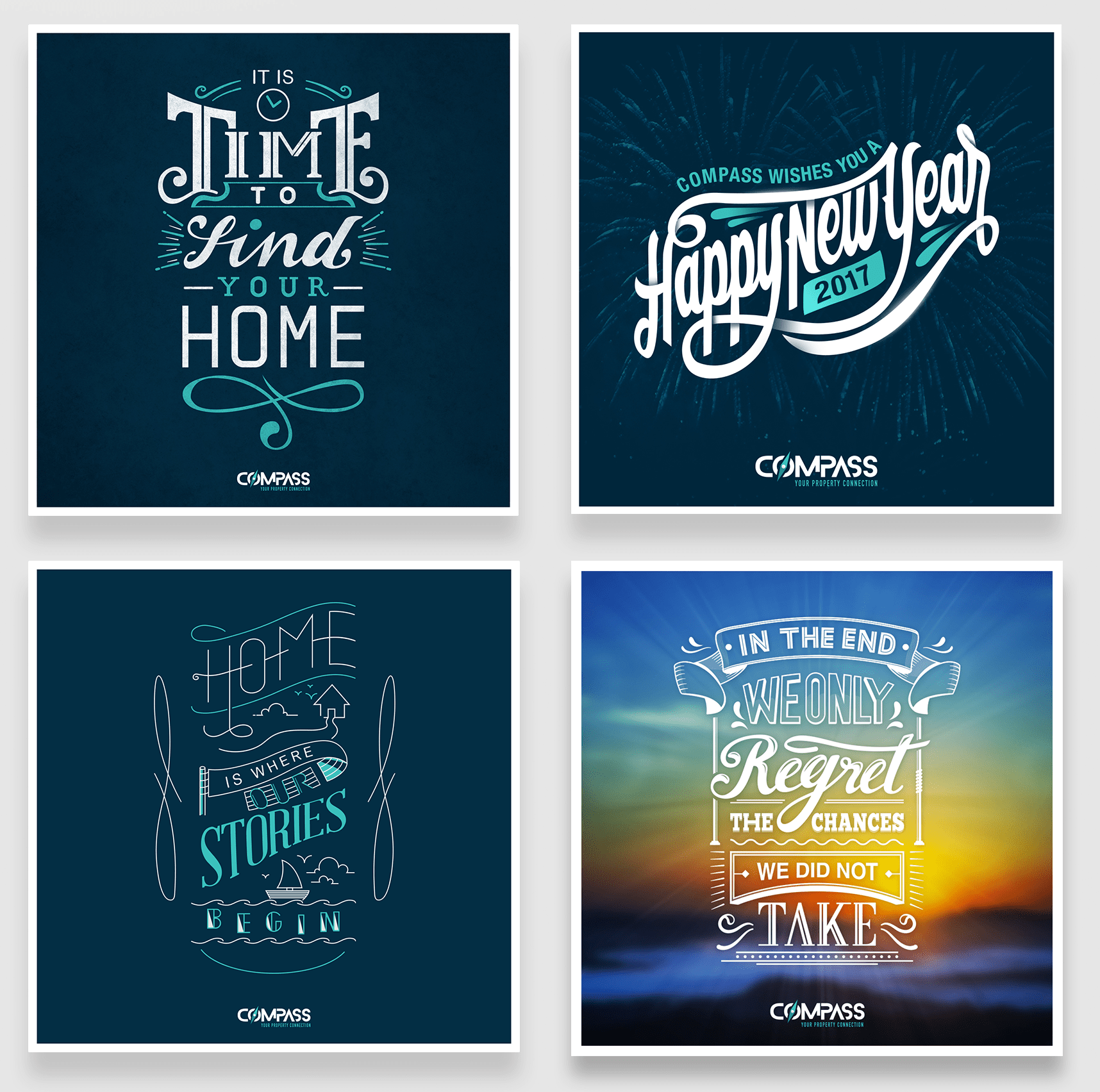
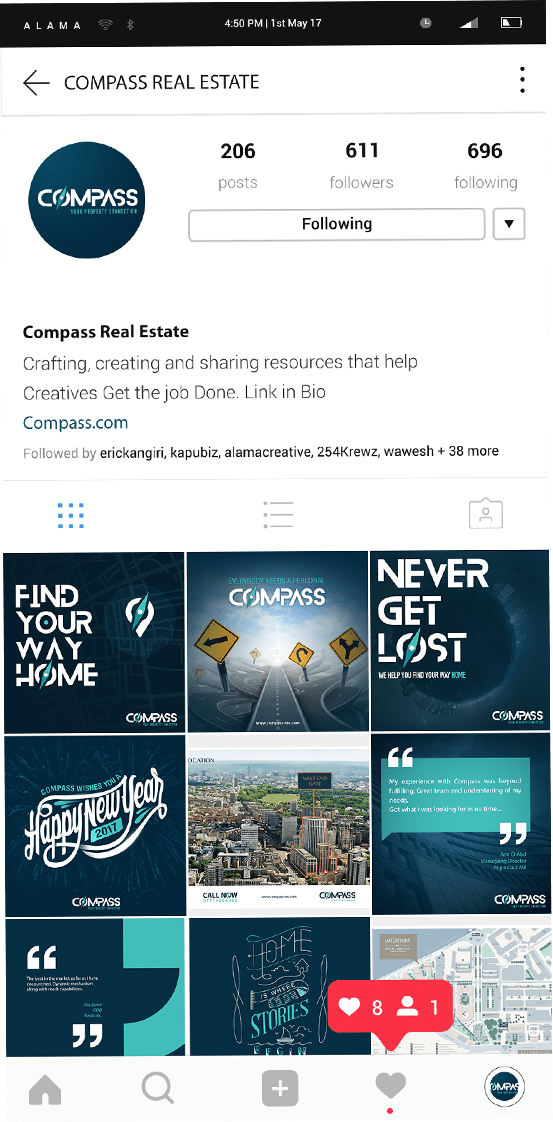
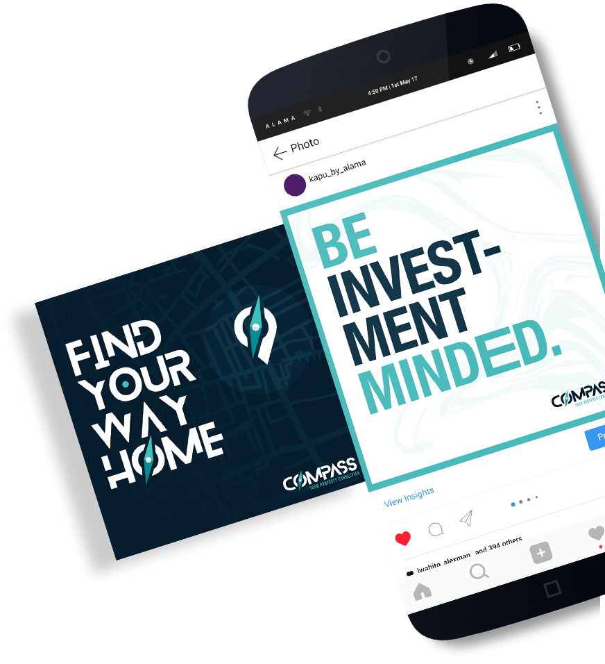
Social Media
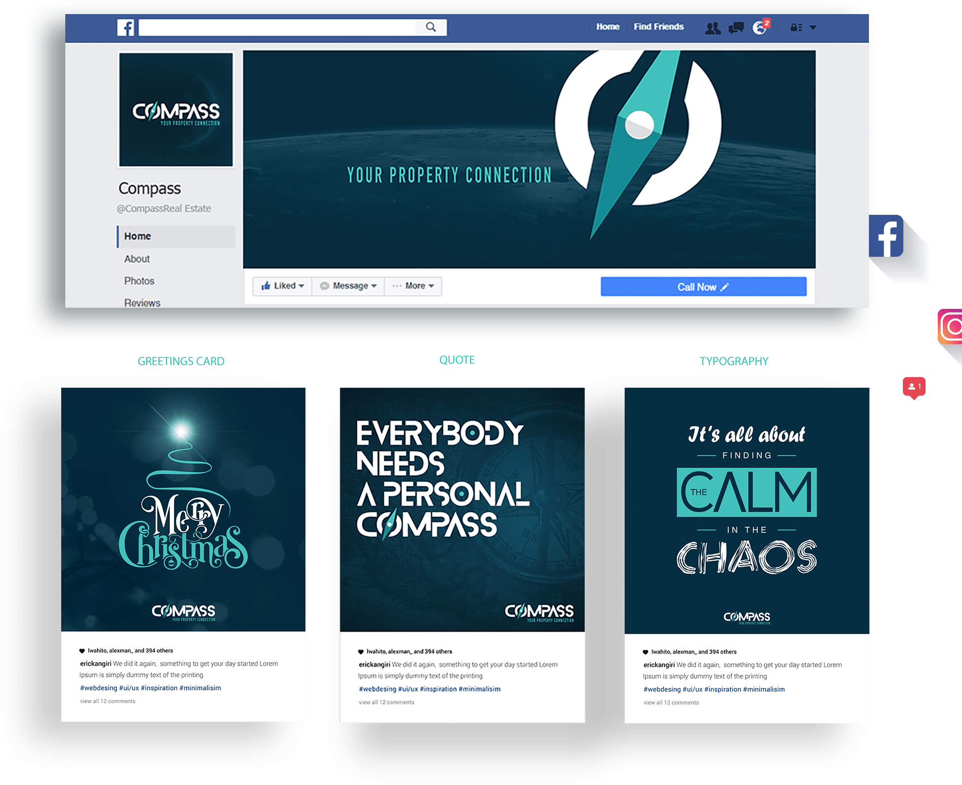
- Calligraphy & Typography Posts
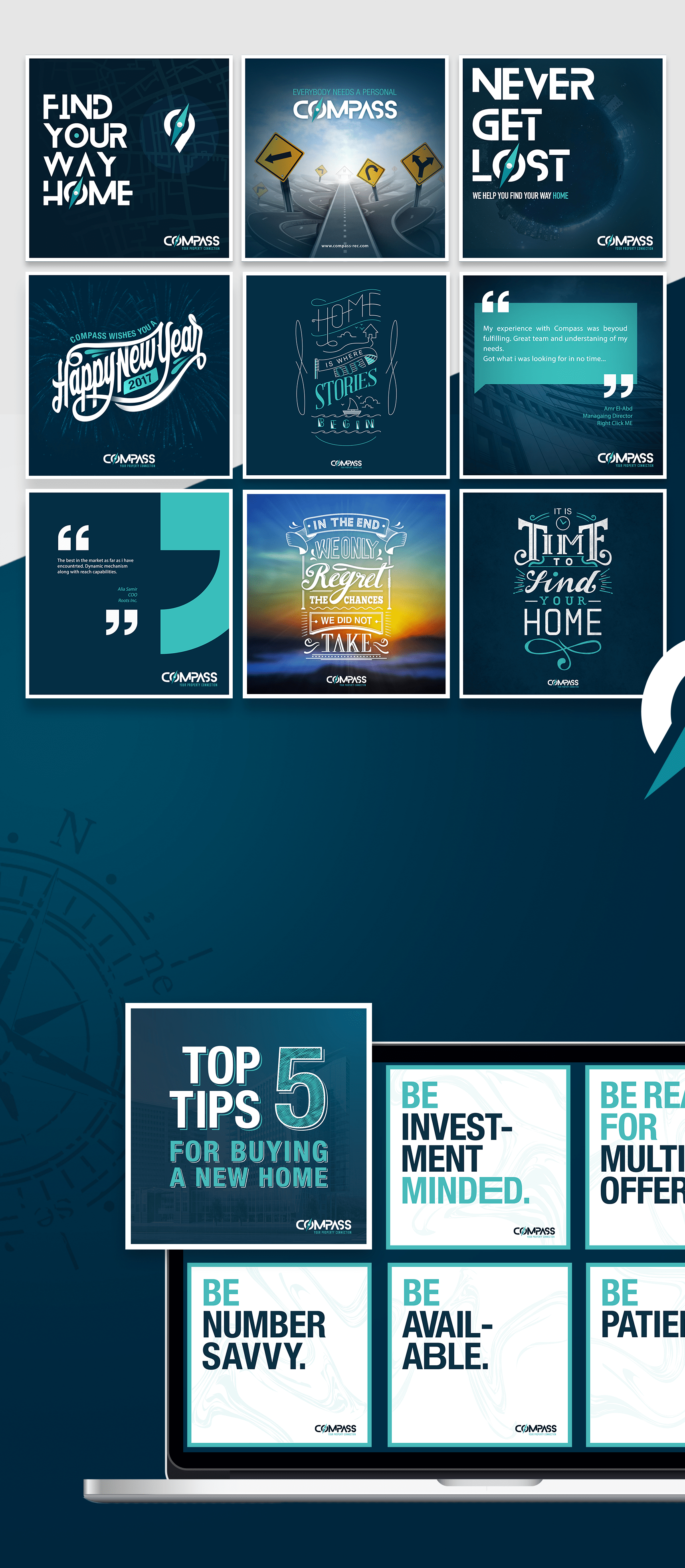
GIFs

The Result
We were able to showcase Compass’s unique brand traits for what they truly stand for— an original name in a market flooded with imitations.
Finally, Compass reached its goal of helping all those in need of guidance in the shape of a company that they can trust.